I was asked to work on a full UX/UI end to end software project over an 18 month period. I led the UX process and guided a small team of 2 UX designers whilst collaborating within a larger team of JavaScript developers. Being the lead UX/UI designer, I was involved in prioritising work in the weekly sprints, updating the rest of the team and making sure we hit deadlines. I conducted research, analytics, design and worked on CSS for production. I would also get involved in weekly demos to the team and stakeholders.
CRM Software UX Improvement + UI Redesign
My Role
Project Summary
The CRM software is an application that saves time by being efficient for Call Handling services both in-house and for selling to external companies. It removes the pain of finding both customer membership details and customers breakdown location at the same time. Within seconds the location details are shown on screen via Google maps and customer details populates the forms.
- Platform
Responsive design – smallest size iPad, large desktop and TV screen for training presentations.
- Team Members & Collaborators
Senior UX Designer (me), UX Designer, Junior UX Designer, Technical Lead, 8 JavaScript Developers, Lead Architect, Product Owner
Challenge
The business is going through a transformation to upgrade all its technology. The original software is over 20 years old and is in urgent need of an upgrade.
Over the years, software modules had been bolted-on, which added to the complexity and was slowing down both the system and the users. The UX had rarely been thought about.
To ensure the user experience is good for the call handlers, I need to apply strategy, user research methods and UX design.
Process
Working in an Agile environment with Daily Standups and weekly demos. I would often give a presentation to the team and various stakeholders.
The overall process was strategy, user research, design, usability testing and production.
Stakeholder Interviews
In the beginning, I interviewed stakeholders in order to find out more about the project with a list of high-level requirements:
- Identify the project’s goals and deliverables
- Identify team members and their responsibilities
- Develop a rough product plan
- Define the key success factors
Contextual Interviews
I carried out a number of contextual interviews in the Call Handling Centre to understand the current application from the users point of view. This was a real insight as old style grey pop up windows appeared for each and every task. This meant there could be a dozen or more different windows on the screen whilst the call was in progress. The user had very restrictive journeys through the application and this slowed down calls if a completely different task was needed.
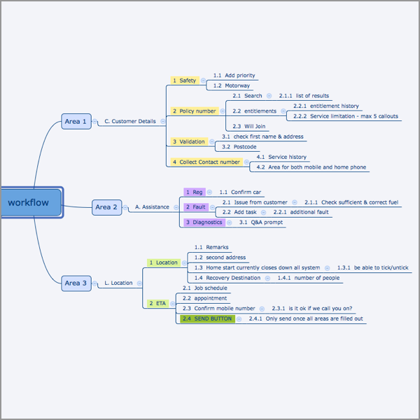
Site Map
The original application had no documentation in terms of an overall site map. So I created a map along with user flows to help us all understand the current complexity of the product.
Card Sorting
For the new application, I was involved in a card sorting exercise whereby we worked out the information architecture. A team of us, some with in depth knowledge of the original application, wrote labels on sticky notes and attached them to the whiteboard. We then spent time working out where things should go. Whilst this captured most of the items, others needed to be moved around at a later date. They were dependant on whether they were included as MVP.
User Journeys
I created user journeys for us to have an updated understanding of the latest work carried out. It also helped give us a good overview for the stakeholders and developers to easily navigate the complex system. There was a lot of input from colleagues that had years of experience with the old system and I could use their expertise to ensure the details were correct. It also meant any major changes could be agreed with the business.
Personas
I created personas in order to understand the type of people using the current system. We had a number of specific types of users, including a fairly high proportion of call handlers that were colour blind, some were partially blind or had tunnel vision and one individual that was totally blind. Also not everyone would be using the system for breakdowns as some would use it for patrols, dispatching and third party garages.
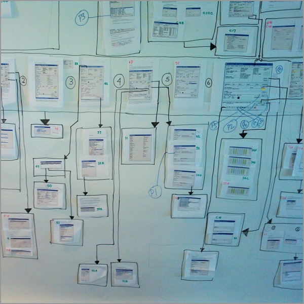
Wireframes
I created low fidelity wireframes to iterate through many design options in a short space of time. We had many discussions and constantly needed updates.
Prototypes
Seeing is believing, and userflows finally “clicked” for the stakeholders after I had them play with my Axure prototype.
Usability Testing
We used the prototypes for user testing which helped us focus on priorities. This was a great start however as the build was in progress it eventually became easier to use the real application using version control to test it. Every week we had testers come over from our call handling centre providing valuable feedback.
Style guide
We needed a style guide that helped designers and developers keep to the standard design, so I used InVision which was a great way to distribute it for everyone to work from.
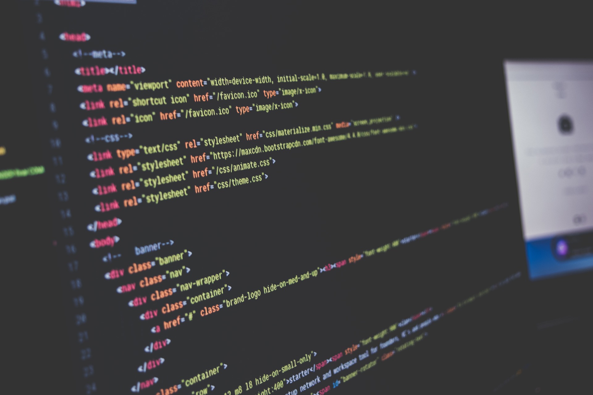
CSS & SASS
As the application was so complex it was efficient for me to build the design using SASS. This preprocessor enabled me to create variables and mixins which saved time for the constant changes and helped towards an efficient responsive UI design. We had JavaScript developers using Angular JS for the functionality and we all used Git for our version control.
Results
The project had many challenges, perhaps the main one was the amount of complex information that needed to be shown within the screen at once whilst the call handler is on the phone to the customer. This was overcome by understanding what was most important to the users on certain tasks by using progressive disclosure and only showing the top most used 20%. Then if they needed to drill down to further information it was made easy for them.
Once the project had been through many iterations and user testing it gradually went live with 100 users, giving us continual feedback. Then eventually the application was rolled out to over 4000 users. The average call handling time by was reduced 40% because of the efficiencies we made all relating to the users needs. This in turn made the application far easier and intuitive to use which reduced the training needs from 6 weeks to 2 weeks.
I really enjoyed this project as I was involved in many different aspects of it over a long period of time. I especially enjoyed the iterations of the designs and seeing the development of the project change so much. Every demo presentation showed how it became more and more of a sophisticated application.